My previous post highlighted a gap between the Glasgow CoP26 mitigation targets and GHG emissions data. The best example here is the selection of methane as a priority while the big elephant in the room, CO2, mentioned in passing, escaped almost unscathed. Indeed one could argue that such global meetings must make choices, some of which might not be too popular. Nevertheless, the critical question here is how such decisions are made and who is calling the shots. As we know, it is national government officials who, in the end, meet behind closed doors and hammer such agreements.
The UN Sustainable Development Goals (SDGs) sit on the opposite side of the spectrum. With 17 goals and over 250 targets covering most development areas, it is almost impossible to argue something might be missing. And at least five of its goals are focused on climate change and the environment. Moreover, the SDGs were designed to be universal and thus improve on the previous Millenium Development Goals. Consequently, countries North and South can always find goals and targets that match local priorities. And if they do not, they are certainly welcome to add to the list. But, of course, Glasgow’s scope was not to create a climate change agenda of such magnitude. Instead, it was supposed to move the 2015 Paris Agreement forward. And here, net-zero became its clarion call.
Being that as it may, some of Glasgow’s targets seem to focus on specific issues relevant only to a selected group of countries or regions. That would undoubtedly make a lot of sense if we strategically use current GHG data to identify the largest emitters of methane, coal consumption in the energy sector, CO2 emissions in the transport sector, and GHG emissions dues to land use change and forests (LUCF) to then recommend they take rapid action. But unfortunately, that is not how things work, apparently. Evidence-based policymaking only goes so far, especially when the powers at be are causing the most trouble in many instances.
Regardless, we know most developing countries have historically contributed little to the current glut of GHGs in our atmosphere. We also know that such emissions are closely correlated with the development of Capitalism, starting in the late 18th Century. The best example of such correlation is China, a country that did in 30 years what the UK and others took over one hundred to do – without plundering overseas colonial territories. According to the World Bank, in 1992, the country was part of the LIC cohort. Recent estimates indicate China could join the HIC team as early as next. Yet, at the same time, China has become the top CO2 emitter in absolute terms.
Albeit complex in nature, CO2 emissions share one key trait with the prevailing economic development model. Pervasive inequality. And while we hear plenty about income and wealth inequality, the noise level in the CO2 emissions realm is low by most standards. Usually, it focuses on the world’s top emitter and then pivots to the endless dangers of “communism.” So we better take a closer look to assess this scenario.
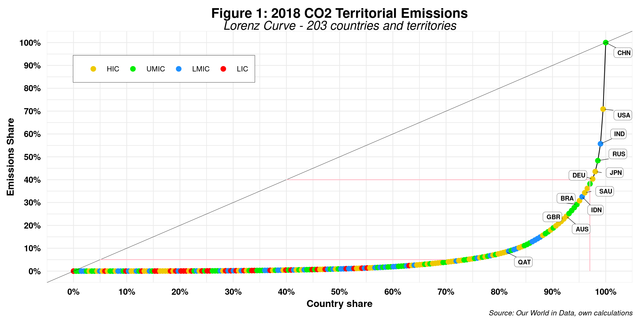
Figure 1 displays the Lorenz curve for 2018 CO2 total emissions by country.
A couple of clarifications are required before diving into the data. First, territorial emissions cover all those produced within a country, disregarding where actual consumption happens. The latter might occur internally or in another country after exporting the goods. In 2018, the U.S.was the lead importer of CO2 emissions while China was the top exporter. Net Co2 emissions should incorporate such emissions, to be more exact. But data on so-called consumption emission is still scarce – and subject to debate. Second, using absolute CO2 emissions as a baseline assumes that all countries have the same population. As a result, the x-axis is the share of countries and not the standard population share.
Indeed, China is the CO2 world champion, as we are constantly reminded by mainstream and social media, with the U.S. and India getting silver and bronze medals, respectively. But that is certainly not the most shocking result of the above chart. Note that the area underneath our multicolor chain of small bubbles curve seems pretty small compared to the space between the thin 45-degree black line and the same curve. That immediately suggests a very high Gini coefficient which for this curve is 0.884, a number strikingly similar to that found only in Bitcoin country, with the big difference that here we are talking about all of humanity and not just the 50 million or so inhabitants of that particular crypto world. But if we need to cite a statistic from this graph, we can then share that the top 3 percent of countries (6 in total) generate 60 percent of all emissions, whereas the bottom 70 percent (142) barely emit 5 percent of the total (check the thin red lines in the graph).
Needless to say, the assumption of equal population size across all countries does not really hold a lot of water. Therefore, we are better off if we use Co2 per capita instead. Figure 2 depicts such a distribution.
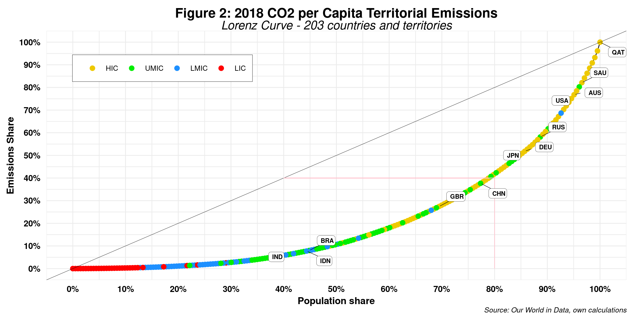
First, the leading countries in the previous graph have moved down along the curve. Qatar is now the gold medalist. A closer look at the data shows that the top seven CO2 emitters are high-income countries (HICs) with populations smaller than 5 million. India is the nation that has moved farther down, while China is now not even part of the top 20 percent of CO2 hoggers. Second, the area under the multicolor curve is now relatively more extensive than previously. Indeed, here we obtain a Gini of 0.571, a vast improvement. However, before we uncork the bubbly, note that such a score still places CO2 emissions as one of the most unequal countries in 2018, right behind South Africa, Namibia and Botswana. Third, the top 20 percent of the population now emits 60 percent of all CO2, while the bottom 50 percent can only muster just over 10 percent. Those figures should be repeatedly shared with policymakers. Last but not least, as expected, a high correlation between income per capita and Co2 per capita is at work here, as we can intuitively see by the curve’s color distribution – red at the bottom and primarily yellow at the top. Statistics say that the correlation coefficient between the two is 0.784.
We could repeat the same exercise for all CO2 components (oil, gas, coal, cement, etc.) and even other GHGs (methane, nitrous oxide and LUCF) and get similar results, perhaps except for LUCF (but that is a topic for a separate post). Table 1 below shares Gini estimates for core CO2 and GHG rubrics and compares three non-consecutive years to detect possible trends.
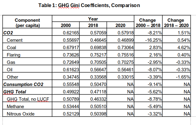
Looking at 2018 alone, we note that, ignoring flaring, gas emissions have the highest coefficient, with coal trailing by a tiny bit with both well above that of total CO2 emissions. Moreover, methane, nitrous oxide and LUCF emissions (using a proxy here) are below core CO2 rubrics. Recall that the higher the coefficient, the higher the degree of emission concentration by a smaller number of countries. The lower GHGs can thus be explained partially by the fact that a more significant number of countries at the bottom of the emissions engine are producing them. On the other hand, coefficient rates of change signal potentially good news, at least until 2018. Except for coal and flaring, all others have declined, with oil among the top three. However, by 2020, some of these trends seem to be reversing. The negative impact of Covid on the global economy will probably translate into further declines. Nevertheless, these numbers should be taken cautionary as the number of countries reporting data for the various categories varies over the years.
In any event, carbon emissions inequality is significant by any standard. So maybe those countries that have contributed less to the overproduction of CO2 should call for a global goal that targets the unequal production of CO2. For example, SDG 10 focuses entirely on reducing income and wealth inequality and is supported by 10 targets. Needless to say, the ultimate objective is not to achieve more CO2 equality but rather to ensure the planet is still livable by the end of the century while poorer countries can still strive to develop sustainably and reduce glaring socio-economic gaps once and for all. Global mitigation targets should thus be framed in this context, with or without net-zero.
Raúl

Comments
One response to “Carbon Inequality”