IPCC reports usually include an annex containing a climate glossary where key terms are succinctly defined. The latest report is no exception, providing an extensive dictionary consuming over 30 pages of text – yet less than 1% of the report’s length. Bringing into the fray four key terms will suffice for our purposes. They are 1. Climate System. 2. Climate. 3. Climate Variability. And 4. Climate Change. We have probably used 2. almost daily for centuries now. On the other hand, 4. has become more fashionable in the last 15 years or so, even for die-hard climate change deniers. The other two are certainly a bit more technical.
Climate is the statistical representation over a given period of the status of the always dynamic Climate System, propelled by its five interactive components. Climate’s core variables (temperature, precipitation and wind) are subject to variability due to either intrinsic Climate System dynamics or extrinsic factors such as volcanic activity or the always perilous human activity, for example. Climate Change happens when Climate Variability persists for decades or more. So looking at the long run is crucial for detecting Climate Change.
In a previous blog entry, I used the most recent CO2 annual data (2020) to depict the glaring emissions inequality across over 200 countries and territories. In a nutshell, a few emit the most, and the most emit little. So what else is new? While relevant and undoubtedly accurate, such data does not reveal the whole picture as the long-term accumulation of C02 emissions is not captured adequately. Thereby, we need to look at countries’ historical C02 emission records. A two-fold unevenness immediately pops up here. First is the uneven development of capitalism between (and within, but that is another story) countries, with most still taking baby steps in such a direction. And second is the data collection disparity, partly the result of the first. Indeed, if a country has nearly zero CO2 emissions, then the need to quantify them is certainly not a top priority when other socio-economic and political gaps are more pervasive.
Figure 1 shows the distribution of cumulative CO2 emissions since 1750. Only Great Britain was recording data at the time and probably doing most of the damage, thanks to the nascent Industrial Revolution. Note that the median for CO2 data reporting for all countries is 71 years. And let us not forget that CO2 stays in the atmosphere for centuries, so whatever was produced back then is still up there, alive and kicking. For comparisons with the previous post, I am using absolute amounts, thus disregarding population size.
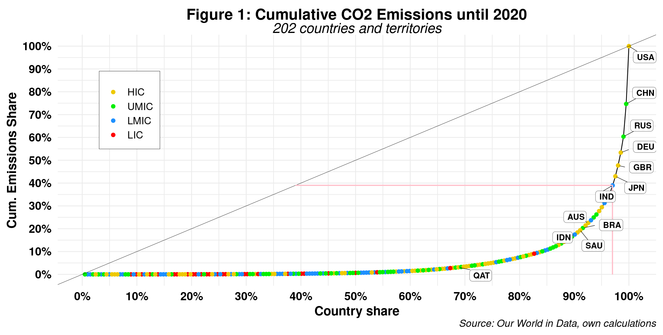
We also assume that data recording started when a country began CO2 emissions or had a slight lag. That said, we can see this graph is strikingly similar to the one using 2020 annual data, but with a few caveats. First, the country rankings are slightly different, with the U.S. way ahead of the rest, despite China’s best efforts. India has lost the bronze medal to Russia, while the U.K. has gained plenty of ground, as expected. Second, the top 3 percent of countries have emitted 61% of all CO2 into the atmosphere, a gain of 1 percent on the 2020 data. On the other hand, the bottom 70 percent cannot even reach 4 percent. That suggests a more unequal distribution of CO2 emissions confirmed by a Gini coefficient of 0.888, slightly higher than previously. But again, the assumption that all countries have the same population is unrealistic – although it is widely used by most as a critical reference point.
One way to introduce population size into cumulative CO2 emissions is to divide a country’s historical total by its current population. However, that assumes that today’s population is responsible for the actions of those who preceded them. Although many might agree, I do not think we can reach a consensus here. Therefore, the best way to move ahead is to take the annual CO2 emissions per capita per country and add them for all the years data is available. That is what figure 2 depicts.
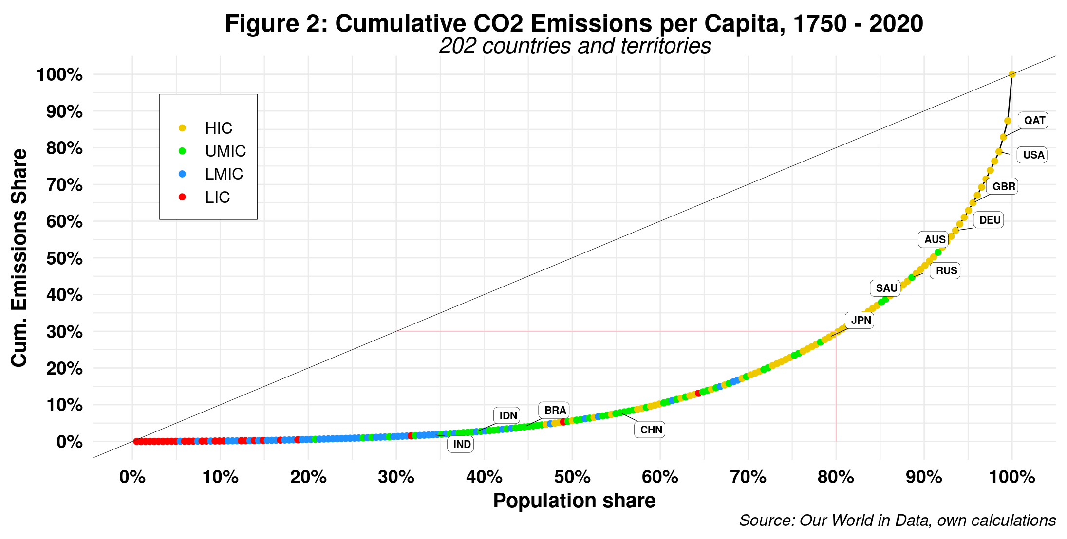
Here, we get a very different picture from our results using CO2 annual emissions. For starters, country rankings have changed substantially. While the U.S. is now fourth, the U.K. has risen to the top ten. The other eight spots in that slot are countries with populations under 5 million, except the UAE. In addition, while India, Indonesia and Brazil have moved little, China has lost quite a bit of ground, thus getting closer to them. These countries’ historical CO2 emissions per capita are relatively small compared to the rich countries. Second, cross-country inequality has notably increased. We see that the top 20 percent of the population has emitted 70 percent of all CO2, while the bottom 60 percent are responsible for only 11 percent. As a result, the Gini coefficient has increased from 0.571 to 0.690. Note also that the top 20 percent only includes five non-HICs, namely, Kazahkstan, Russia, Turkmenistan, South Africa and Ukraine (the lonely LMIC on the top echelons), thus suggesting a strong positive correlation between GDP and CO2 production.
To date, the world has emitted over 1.6 trillion (tera-, 1o^12) CO2 tons (1 ton = 1,000 kgs, or 2,200 pounds), a number that is over 17 times larger than the 2021 World’s GDP (94 trillion U.S dollars) if we use kilograms as a baseline. The historical average of cumulative CO2 emissions per capita is 411 tons. To understand this number better, recall that a male adult elephant weighs 5 tons on average. Doing the math reveals that each of us should “get” 80 elephants. That would indeed be a logistical and financial nightmare – never mind the poor elephants.
If we assume that perfect C02 emissions equality should be the ideal scenario, the total emissions required to get there amounts to 3.19 trillion tons. That is twice as large as the current total. In other words, and given the Remaining Carbon Budgets, we will need to find two additional planet Earths to achieve such a goal, as this one seems to be slowly dying right in front of our eyes, those in power looking elsewhere, of course.
Raúl
