Lack of data is certainly not one of the issues at the table when discussing energy production and carbon emissions. Well-known sources for the former include the UN Statistics Division, the International Energy Agency (IEA), the U.S. Energy Information Administration (EIA), and British Petroleum (BP).  The latter publishes an annual report while IEA data is behind a paywall. EIA offers open data access to a vast number of resources, including international carbon emissions. The main source for the latter is the Global Cabon Project created in 2001 and operating as an international partnership. The World Bank has carbon emissions data starting in 1960, but updates seemed to have stopped in 2014. The Global Carbon Atlas, initially funded by the BNP Paribas Foundation, is a good secondary source for emissions data, linked to the Global Carbon Project.
Before taking the dive, we need to take a closer look at the data itself. First, there are three types of fossil fuel emissions data. One is called production data (or territorial), which assigns emissions to the countries producing related goods and services, disregarding exports and final consumption. The second is known as consumption data. Here, countries, where the actual consumption of goods takes place, are assigned the respective CO2 emissions. The source of such data distinction partly comes from the claim by developing countries that population within their boundaries were not the final consumers of the products generating carbon emissions. Needless to say, such is the case of many countries, not just developing nations. The difference is in the actual volume of imports and exports. Finally, transfers data is the difference between production and consumption data. Positive transfers indicate that countries are net exporters – national emissions are thus reduced. This seems to be the case for many developing countries.
Second, fossil fuel emissions include five sources: cement, coal, flaring gas, gas, and oil. Total emissions for one country are calculated as the sum of each of these sources, usually on an annual basis. Carbon emissions are presented in millions of tonnes, a ton being defined as 1,000 kilograms (2,204.6 pounds). Methane (CH4) and Nitrous Oxide (N2O) are usually computed separately and are thus not part of these sets of estimates. I will be using production data for my analysis.
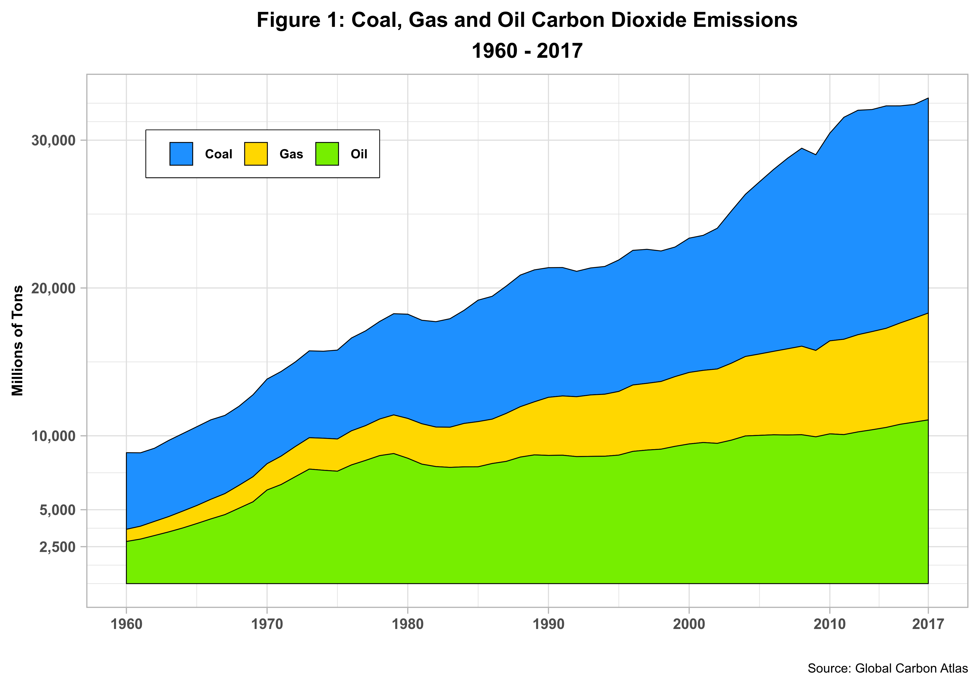
Figure 1 presents the historical evolution of CO2 emissions by its three main components, The series is only available until 2017.
 This is perhaps one of the best-known CO2 charts. Emissions have grown almost 300 percent since the 1960s. While gas has gained some territory, coal is still the lead emitter. Indeed, the death of coal has been greatly exaggerated. The question here is on the demand side. Where is, is demand coming from? In this light, the issue with U.S based coal production is not lack of demand but rather higher costs amid increased global competition. Theories of differential rent could be used to explain this particular situation.
Less familiar to many of us is the distribution of emissions by overall income levels, as shown in figure 2.
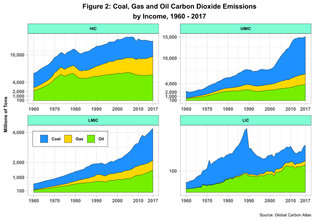 Here we can find the answer to our previous question. Both upper-middle (UM) and lower-middle-income (LMI) countries heavily use coal, whereas high-income countries (HIC) rely mostly on oil, with gas expanding rapidly and coal declining slightly. Low-income (LIC) countries also have oil as the primary source thanks to the decline in coal use by both North Korea and Zimbabwe, the latter having feel off the radar screen since the national crisis started several years ago. In any event, the total emissions for LICs are relatively small when compared to that of the other categories. LICs emissions are less than 1% of the total throughout the period.
Looking more closely at the data, we note that by 2017, China accounted for almost 80 percent of coal usage in UMICs while India played a similar role in LMICs. Coal-based industrialization and capitalist development seem to be the norm in these nations, following pretty much the model set by Western countries in the last two centuries. Finally, note that gas, once touted as a “greener” alternative, is gaining ground in all income categories.
Using a log scale to magnify countries sitting at the bottom of the emissions pyramid, figure 3 depicts the top five countries for each of the income levels defined by the World Bank for 2017 – bubble size determined by the total in-country population.
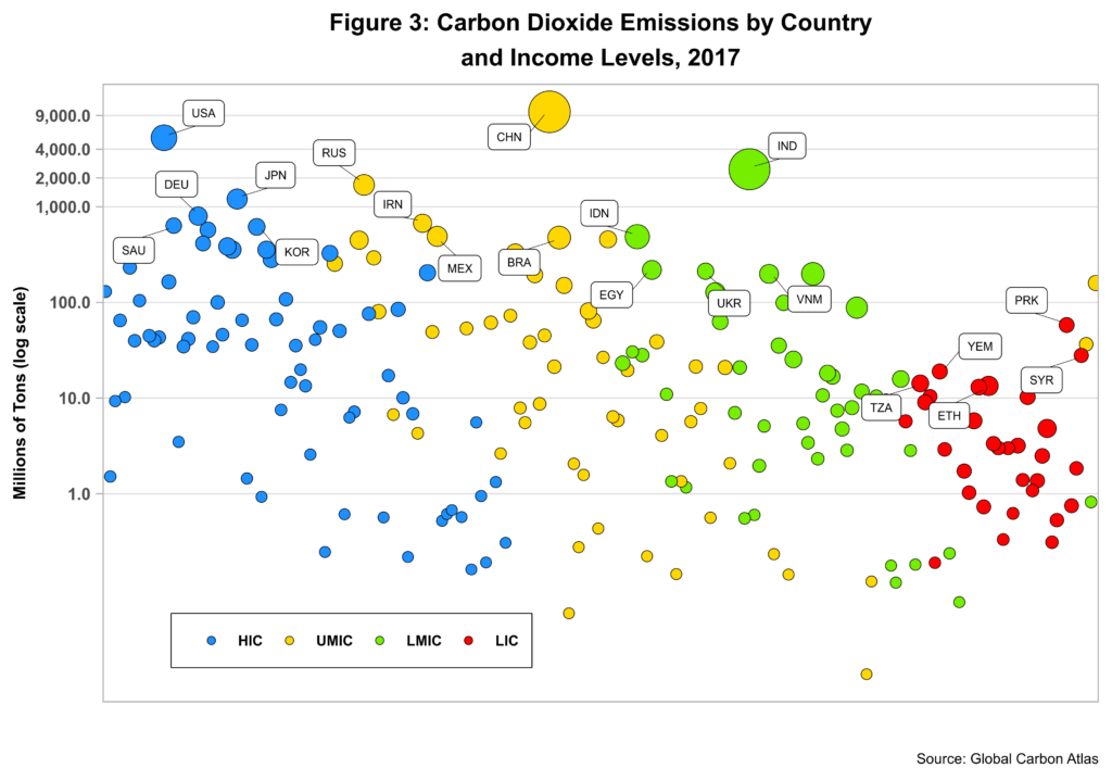 The U.S, China, India and North Korea are the leaders for each of the four categories. In absolute terms, the pack is led by China, followed by the U.S, India, Russia and Japan. Interestingly, several of the top five in the LIC group are nations in conflict or emerging out of conflict. Note the correlation between emission levels and income levels, which reports a value of 0.566 for the whole period, overshadowing that between emissions and population, which comes to 0.44. Recall that some of the initial debates on fossil fuel emissions circled on population growth with some analysists openly supporting neo-Malthusian arguments. Not that these views have nowadays wholly evaporated from the environment.
Figure 5 adds further nuance to the connection between emissions and population. The graphs used log scales for both CO2 and population.
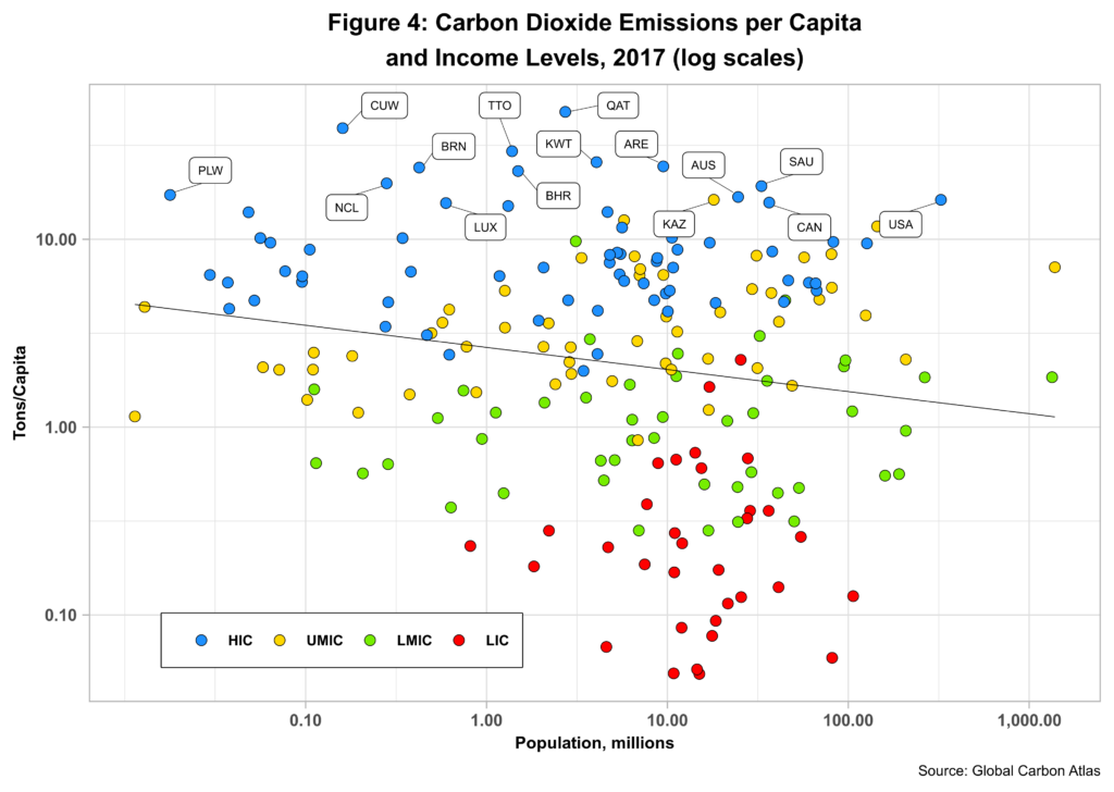 The top 15 countries are labeled with Qatar taking the top spot. Note that all countries with higher emissions per capita, excluding Kazakhstan, belong to the high-income category with most having relatively small populations, In fact, the U.S. is the only top 15 country with a population greater than 35 million. On the other hand, most LICS and many LMICs have low emissions regardless of population size. The black regression line confirms this trend and ends up suggesting a negative relationship between emissions levels and population size. The prime movers here are economic growth and capitalist development – and not just population size.
So are all emerging economies heavily reliant on coal? Figure 5 below provides some answers by presenting the emissions shares for coal, gas and oil for the top twelve countries, excluding all those classified as non-high income.
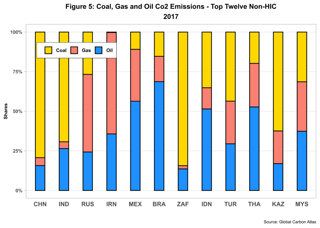 China, India, South Africa, Turkey and Kazakhstan are coal hungry while Mexico, Brazil, Indonesia, Thailand and Malaysia (to a point) rely mostly on oil. Russia and Iran are the only ones betting big on gas with oil playing the second violin and coal shinning by its absence. It thus seems that there is no one size fits all for using fossil fuels to propel economic growth.
But the bigger question is if developing countries can find ways to effectively harness renewable energy to foster capitalist development. At this point in time, the options, while multiplying, seem to be limited. No doubt, additional technological innovation is needed to ensure cleaner technologies are as effective and scalable as the much-undesired fossil fuels.
Cheers, Raúl
Updated on 2019-12-03.
