GDP (Gross Domestic Product), the statistic most frequently used to measure wealth creation in terms of goods and services, has been the subject of critical review for the last 25 years. Green National Accounting (GNA) and the ensuing Green National Product (GNP) have been suggested as an alternative that captures the impact of capitalist development on nature and the environment on a global scale, which GDP blissfully ignores. They have been around for a bit, and, indeed, some countries are starting to embrace them. However, they have also been subjected to critical review that has certainly not helped expedite widespread deployment. Imagine that at the recent UN COP, countries had more precise measurements on the impact of economic growth on nature. More decisive action could certainly have been pursued with that in hand. Evidence-based policymaking is the catchphrase used in such cases. Not to deny that policymakers disregard the evidence, overwhelming or not, in many instances.
So while the planet burns out there and millions are on the move seeking safer lands, GDP has been able to avoid the massive fire magisterially. It is thus still king and queen when measuring wealth creation across nations and globally. That is why comprehensive economic reports, such as the latest IMF’s World Economic Outlook (WEO), remain GDP-centered. No comparable measure exists apart from the UNDP’s HDI (Human Development Index). The HDI adds health and education to national measurements, but, like GDP, does not factor in Mother Nature, despite being part of Sen’s original definition of human development. At any rate, IFIs have not embraced the HDI for various reasons, ranging from statistical issues to economic considerations. But that is another story.
We thus have no choice but to keep rolling out the red carpet to GDP. Using data from the latest WEO, I will explore the distribution of wealth creation among countries. The data covers 196 countries (some do not have current information) and includes IMF data estimates from 2021 to 2024. GDP data is offered in three flavors: 1. National currencies (current and constant prices); 2. UD dollars; and 3. PPP prices in international dollars. Two and three are the most useful for our purposes.
Figure 1 depicts the distribution of the country’s share of GDP relative to the number of countries in the dataset for 2020. Unfortunately, data for Somalia and South Sudan are not available.
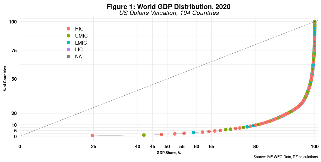
One bubble represents one country, and its color depicts current income levels ranging from high to low, as defined by the World Bank. NA is for Venezuela, which has somehow been removed from such classification. We cannot really see in the chart due to country overlaps at the long tail end of the curve, comprising over 100 nations. One country, the US, accounts for almost 25% of global GDP, while five (the US, China, Japan, Germany and the UK) generate nearly 56% of global output. As expected, most developing countries, except for China and India, are not part of the top tier. More interesting is that 10% of countries (19 in total) account for 80% of world GDP. That is, 90% of all countries in the data account for only 20% of global output. The Gini coefficient is 0.878, which is way up there and similar to Bitcoin’s distribution among Crypto owners.
Using GDP at PPP prices changes things a bit. Now, PPP estimations and estimators aimed at introducing differences across countries in living standards have also been widely criticized, including by the IMF. It augments most GDP estimates, more so for developing countries. In 2020, for example, China’s GDP was 20% larger than that of the US, while it was just 30% smaller at real prices. Moreover, GDP estimates for emerging countries increase between 80 percent and over 300 percent. Large clouds are visible on the horizon.
At any rate, Figure 2 shows the distribution of GDP at PPP prices.
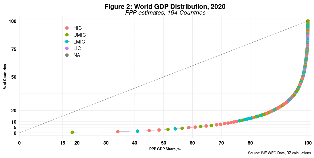
China, India, Russia, Indonesia, and Brazil are now among the top ten countries that account for 60 percent of global output. China and the US create over one-third of global GDP. According to these estimates, 13 percent of countries (25 in total) account for 80 percent of the world’s GDP. The distribution has thus improved a bit, but do not hold your breath. The Gini coefficient remains high at 0.845. So paradise is still far, far away.
Another way to look at the data is by focusing on population distribution. Recall that the PPP GDP valuation substantially increased GDP size in most developing economies, more so for countries with larger populations. As a result, countries with over 150 million people entered the top tier of GDP. Again, however, population works both ways, as shown in Figure 3.
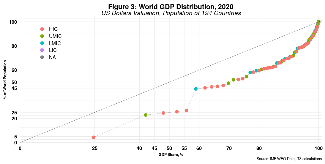 The US has almost 5% of the world’s population and enjoys close to 25% of global GDP. Its distance to the equality line is, by all measures, significant. China, the most populous country, comes next. Note that the path from the US to China is parallel to the equality line. That suggests that the change in population matches the change in GDP share. The following three countries (Japan, Germany and the UK) push further away from the 45-degree line until India comes in with that steep increase in population share, overshadowing the growth in GDP share. Overall, high-income countries tend to pull the curve away from the equality line. GDP per capita levels are at work here. Bear in mind that the US and Japan are the only industrialized countries that have populations over 100 million.
Is this picture bound to change anytime soon, before a global climate disaster arrives? Looking at the past can shed some light on the future, mutatis mutandis. Figure 4 depicts the historical GDP shares for the top 10 countries from 2005 until 2021. For reference, the IMF estimates that global GDP in the latter year will be 94.6 trillion dollars (10^12, not 10^18), an 11 percent increase over the previous year.

The graph uses a log scale for GDP share to depict the evolution of GDP shares for the bottom five countries. The rise of China and the fall of Japan are perhaps the most notable features of the chart. Italy’s decline is also noteworthy, but all countries have experienced relative decline, with China being the exception. Bear in mind that the GDP pie is a moving target, usually increasing but decreasing during economic and financial crises. In that light, a fall in GDP share does not entail a decline in GDP output. However, it suggests that others are growing faster.
Nevertheless, do not expect any dramatic changes unless nature complains even more loudly.
Cheers, Raúl
