In a previous entry, I explored the connections between digital technologies, economic growth and the environment, using the concept of Sustainable Development (SD) as an analytical reference. The figure below shows another way to view the three development outcomes that must interact to trigger SD.
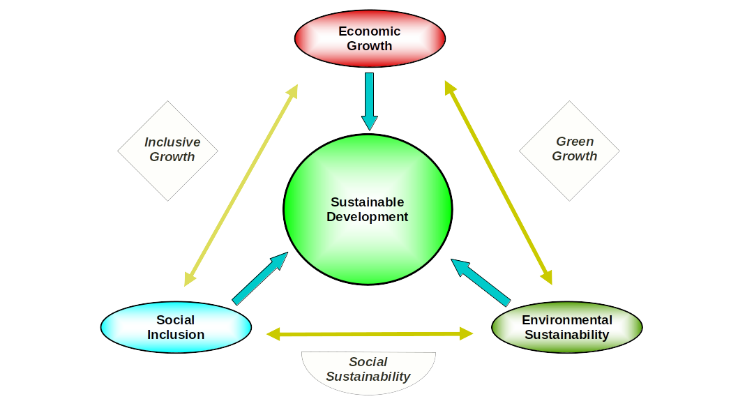
Three other outcomes are also possible if the interaction among the three core pillars excludes one of them. Inclusive growth, green growth, and social sustainability are perfectly viable and logical, but should not be equated with SD at any point. Such a differentiation does have policy and practical implications. The same goes for researchers tackling the thorny subject of economic development and its environmental impact.
I also suggested that Information and Communication Technologies (ICTs) are developmental catalysts that can positively or negatively affect SD and its six development outcomes (three core pillars and three emerging from pillar pair interactions). I have chosen not to add ICTs to the graph for simplicity. In any event, as catalysts, ICTs can interact with any or all of them, with their impact depending on how policymakers and practitioners position them vis-à-vis local development gaps and priorities.
However, to fully grasp ICTs’ potential impact, we first must understand the role economic growth plays. The latter is the primary driver of capitalist development, which some in other quarters call capital accumulation. Seeking continuous growth is part and parcel of the process, not an incidental occurrence. The graph shows that economic growth has four hats, one showing its membership in the SD club—its insatiable growth appetite, constant or perhaps even increasing across the board. Keep all this in mind.
The standard hypothesis most economists put forward relies on the Environmental Kuznets Curve (EKC), which I also mentioned before. It postulates that economic growth, as measured by GDP (or GNI) per capita, initially has a negative environmental impact, but, as overall per-person income increases over time, it turns the tide, thereby minimizing ecological damage. Graphically, such a process is represented by an inverted-U curve. Note that using GDP as a core indicator ignores the various colorful hats economic growth has.
Over the last ten years, more than 1,200 EKC academic papers have been published, propelled by the imminent global climate crisis heading our way. And yet, while sophisticated econometric models and tricks (been there, seen/done that!) have indeed been called into action, the jury on EKC’s actual relevance is still deliberating. Undoubtedly, more than academic reputation is at stake. Ideological battles, overt and covert, are also at work here. Those on the mainstream side of the equation are most likely eager to show that insatiable economic growth deeply loves Mother Earth, with no warnings.
I am not going to go there. Instead, I will take a quick glance at the data, using CO₂ emissions as a core environmental indicator and the notoriously biased GDP estimate as the self-appointed proxy for economic growth. One of the EKC issues under heated debate is its scope. That is, is it relevant for all countries, only a few, or none? I will start with the latter using Figure 1 below.
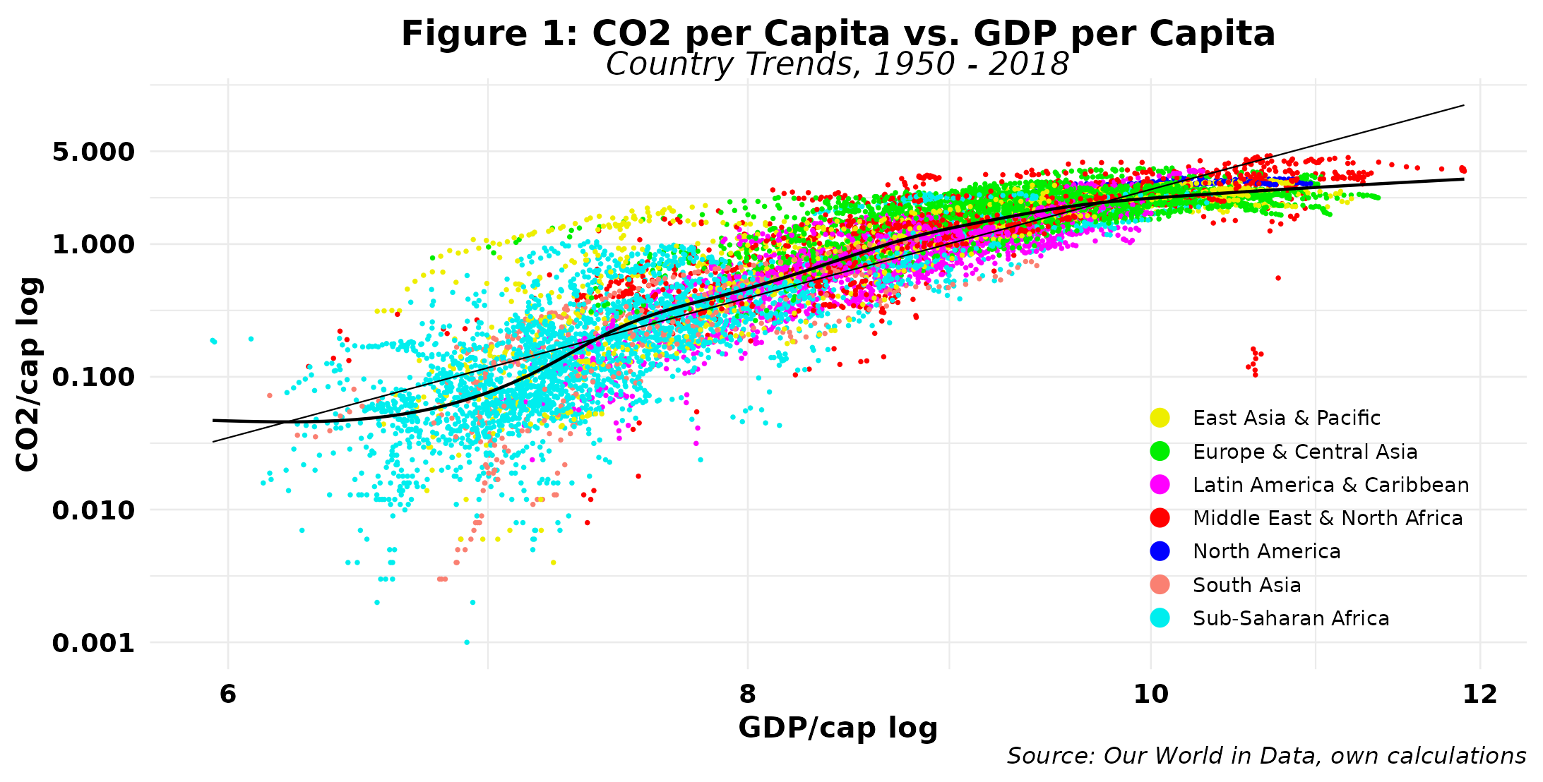
I am using logs for each indicator to tame the outliers that both carry. For example, the maximum GDP per capita for the period is 146k USD, which is 382 times larger than the minimum, believe it or not. Read the x-axis accordingly. While the graph tracks individual country trajectories, I have colored each by region to depict patterns across them. The data covers 165 countries and territories and contains over 10,500 data points. The straight black line shows the regression estimates, which report an R-squared of 0.755, suggesting a strong association between our two core indicators. Note also the neat regional patterns, especially for Europe and Central Asia, Latin America and Sub-Saharan Africa.
The average country trajectory indicates that carbon emissions increase as income grows, but at a slower rate. The polynomial curve fitted to the data, however, shows that the classical logistic (S) curve is fully at work here. GDP is briefly ahead at the start of the process, but soon carbon emissions take charge. As income runs towards the 9k mark, the situation reverses, and GDP is ahead again and seems to remain so. However, there are no signs of the quadratic EKC. We can thus conclude that the EKC does not apply to all countries.
So let us look a bit closer at a selected group of countries. In addition to Great Britain, the Mecca of capitalism, I have chosen the top 2018 CO₂ emitters in absolute terms. I have also increased data coverage, now starting in 1920.
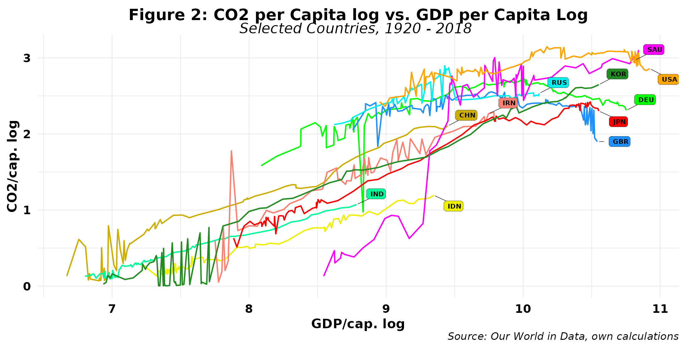
The results are a mixed bag. On the one hand, high-income countries such as the U.S., the UK, and Germany show some compatibility with the EKC hypothesis, as emissions decline, more so in the latter two. But on the other hand, countries in the same income cohort, such as Japan and South Korea, do not. Russia seems to be the odd case out, as emissions relative to income are rising again after a sharp decline. All other countries in the graph appear to have managed to escape EKC’s wrath, albeit some could argue they have yet to reach the critical income per capita levels that would draw it. In any event, the best we can conclude here is that the EKC applies to a few countries. However, we now need to explore in more detail the reasons for that, given the behavior of other high-income countries that seem exempt from EKC’s spell.
That also opens the door to introducing ICTs into the analysis to examine their specific roles in both economic growth (all hats included) and CO₂ emissions. The work is now cut out for us. So, on your marks, get set.
Raúl
