Although not unchallenged, GDP remains the indicator’s champion—I am sure Kuznets must still be delighted about this. Most nations work very hard to make it grow at all costs, as, in principle, the gains translate into higher living standards and human development, which are very laudable goals indeed. The flip side is its use as a competition gauge among countries, all racing to the top. Rankings thus become a feature that we all check at least annually. Many indices that attempt to quantify the diffusion and use of ICTs share this feature. I have had the opportunity to read and even help draft national or sectoral ICT-related policies or strategies. In such documents, increasing a country’s rank on digital government or ICT diffusion within a few years is usually one of the key performance indicators governments add to the menu. And having been around long enough, I have seen a few countries achieve such objectives. Of course, knowing exactly how a specific index is constructed can help governments direct investment and support to particular areas. That is the game of rankings—not thrones. In any event, I do not expect AI indices to overwrite such a feature.
Given AI’s perhaps unique history—the two usual-suspect countries leading the charge, with the rest light years behind—we typically expect rankings to show the former in the top five or ten. However, that is often not the case, as country positioning might also depend on many other factors. In this case, GIRAI’s multidimensional framework measures 19 thematic areas, where government policy, implementation, and dynamics among non-state actors set the so-called AI ecosystem in motion—for a total of 57 indicators per country (plus three coefficients). Stochastic variations are thus very feasible.
The figure below shows country rankings and scores for the four income levels defined by the World Bank (click the images to enlarge).
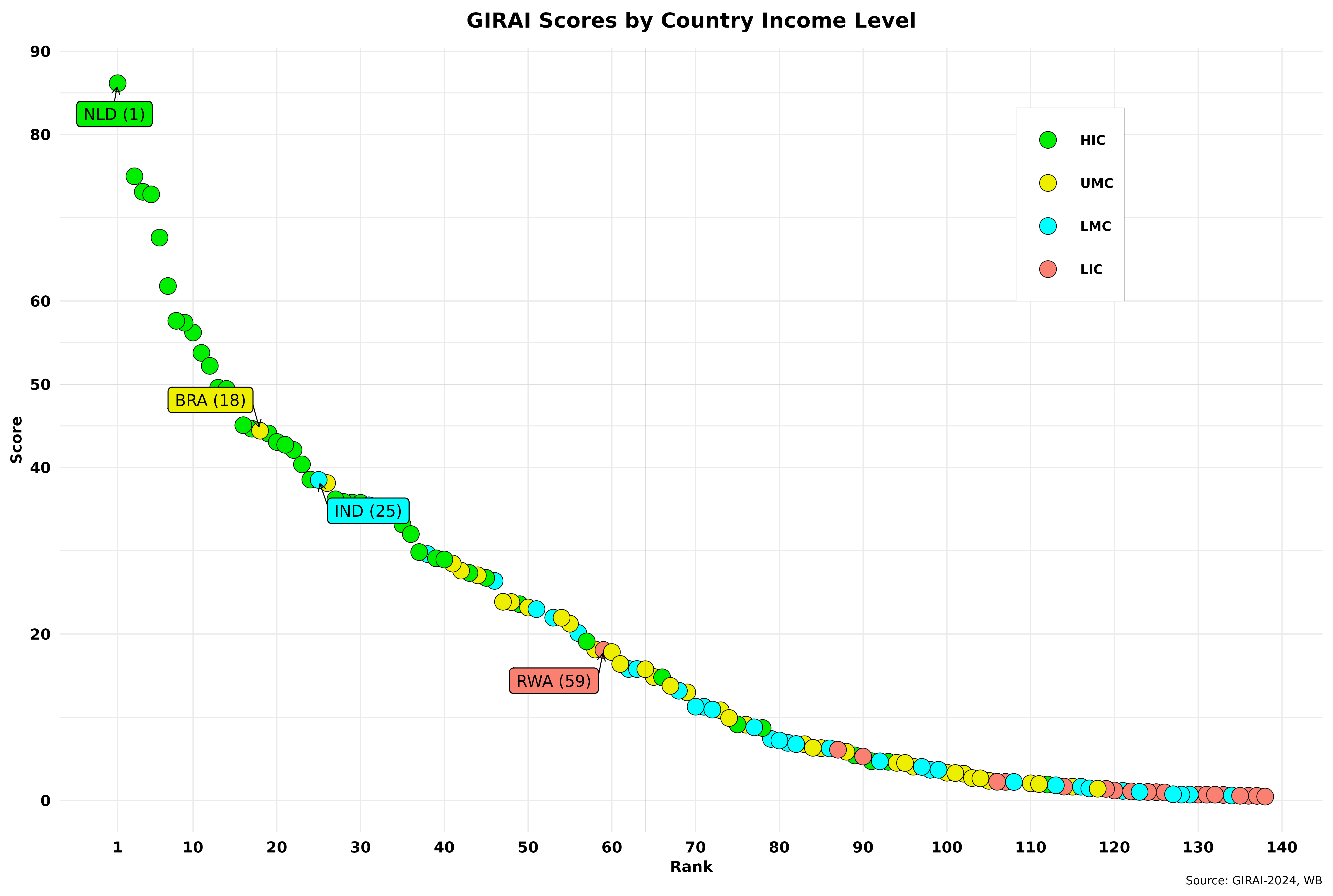
The graph also shows country leaders by income level, with their respective global rankings in parentheses. That’s right—the usual two suspects are nowhere to be found! As mentioned in the first part of this post, almost half of the countries have scores below 20, confirming the “light years behind” part of my take on AI history. In any case, I must admit the top rankings for HIC and LIC surprised me. Regardless, we can intuitively see a strong correlation between income levels and GIRAI scores. I will look more closely at that later on.
To sharpen our focus, I have redrawn the above figure by region (defined by the WB), excluding North America for real estate reasons. It contains only two countries, one of which is the prime suspect, and both are on the selected top-ten list.
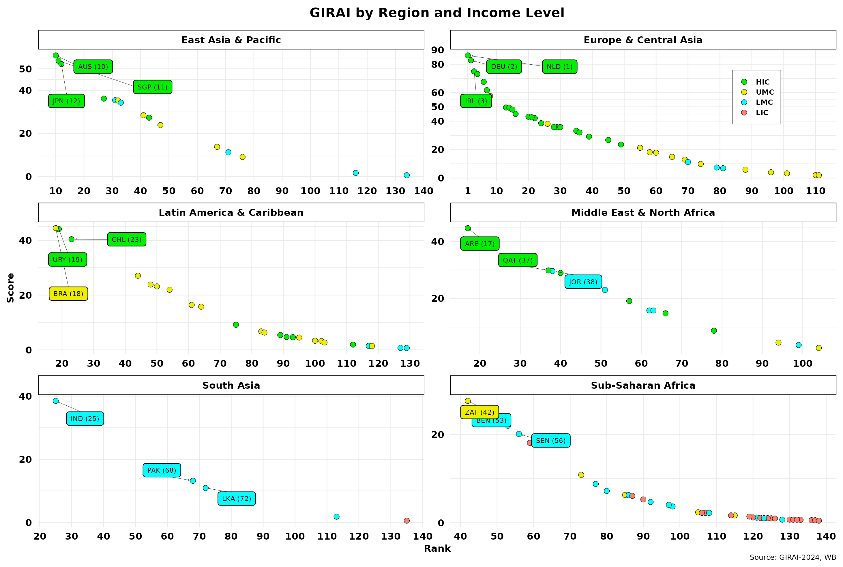
The top three countries and rankings are highlighted. Note that y-scales vary across regions to pinpoint intra-regional differences. HICs dominate where they exist, except for LAC, where Brazil is slightly ahead. But most countries in that area are still taking baby steps. The LIC leader, Rwanda, is not among the top three in Sub-Saharan Africa, while most countries have scores below 10. Europe and Central Asia show the most comprehensive scoring range, with most UMCs and LMCs (in Central Asia) lagging substantially. Let us not forget that not all regions are represented equally, as I previously showed, so indisputable conclusions are unwarranted. And yet, one of the main suspects is still missing in action! In any case, the correlation between GIRAI scores and regions is unclear and appears to vary substantially. Regardless, the distance between the top and bottom scores is significant in all areas, averaging about 40 points, except for Europe et al. That should not be surprising, as I have already shown GIRAI’s score skewness towards a power-law distribution.
Low scores can stem from countries reporting little activity throughout the 19 thematic areas for the three pillars (Gf, Ga, and NSA). Or, countries have pillar activity only in a few of those 19 thematic areas. Thus, we need to thoroughly examine the normalized scores for the three pillars. GIRAI’s dictionary tells us these three variables comprise the “…points assigned to …(the)… indicator according to GIRAI scoring rules, normalised into a 0-100 range.” I am not aware of the scoring rules, however.
Regardless, Table I below summarizes the values and frequencies of the three normalized variables.
Table 1: Normalized Scores Frequencies
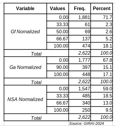
Indeed, most countries’ scores for these variables are zero. Gf is the worst performer, with almost 72 percent of values being zero, while NSA is just under 60 percent. That implies that the NSA normalized score has the most non-zero values for the thematic areas covered. In the previous post, I showed that the NSA coefficient can introduce bias in the estimates. The fact that it has more non-zero scores could magnify its bias impact.
On the other hand, the frequency of 100 scores is relatively high in both Gf and Ga. In the latter, all non-zero scores are high, almost by definition. That can also introduce statistical issues. Perhaps more surprising is the values assigned to these variables. I initially assumed they were continuous, ranged from 0 to 100, and were in line with the other pillar scores. It appears that normalization has made them discrete variables. In addition, the distributions of the actual values are inconsistent across the three variables. The case of Ga seems a bit odd, with only three possible values that are unevenly distributed. There is no middle class in that category—the top 10 percent rule with impunity. Finally, having discrete values to calculate adjusted and weighted pillar scores creates a tight dependence on coefficients and weights to differentiate them from the original series, resulting in a limited scoring system.
The above points out that average normalized scores per country do not systematically cover all 19 thematic areas. The figure below showcases the issue. The thin red line divides the data into two equal quadrants to emphasize the uneven distribution of countries. The data only includes countries with one or more thematic areas covered by the three normalized scores (> 0).
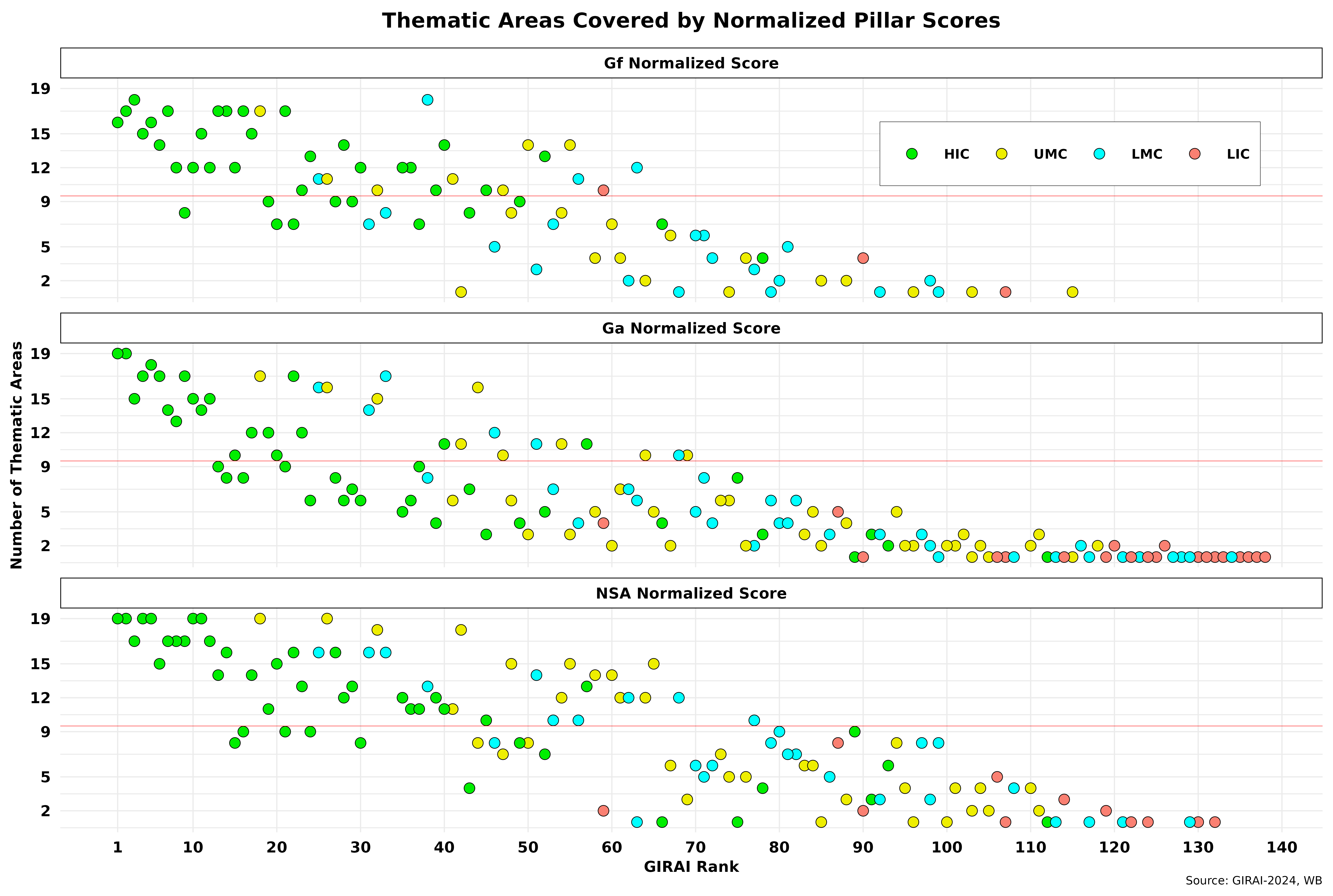
For starters, Ga is the only score that covers all 138 countries across at least one thematic area. Gf is recorded in only 85, indicating that almost 40 percent of all nations report little related activity. The NSA is closer to Ga, with 121 countries. Note that Ga has a long tail of countries below five thematic areas. In all three, more than half of the countries are in fewer than 9 thematic areas, with Ga leading with 101 nations, while the NSA has the fewest at 85. All these numbers follow the patterns suggested by the table above. On that basis, we can conclude that the high number of low scores per country is primarily due to a lack of activity or data. For example, in Sub-Saharan Africa, the average number of thematic areas covered across all three pillars is 3.57, while Western Europe is almost four times larger, with an average of 13.2. Not surprisingly, the correlation between GIRAI scores and thematic areas covered is 0.82, which is highly significant but totally expected.
However, that raises the issue of the analytical framework’s relevance, which seems to be running well ahead of many countries, especially LMCs and LICs. The question here is how these areas were identified and who was involved in making these decisions.
Next, I will examine the 19 thematic areas and the relationship between GIRAI, economic growth and human development, and political regimes more closely.
Raul
