A new version of the World Wealth and Income Inequality database has been available online since last January. The new website has a new slick look. It also offers an interactive tool to view and visualize data on a global scale or by country. For those who love to poke around, looking at the raw data is also feasible, as well as download in interactive fashion. Several formats are available for downloading such as CSV, for example. Selecting a specific data structure for downloading is possible as the site offers four different options.
However, downloading the whole data set with one click is not an option users can select. Nor are there any APIs available that could facilitate such process. The website does not really support Open Data access, unfortunately. Nevertheless, I have no doubt these features are probably in the works.
As a test, I downloaded the 12 main indicators the site offers for 15 countries for the period 1970 – 2015. This was not a simple process as I had to select variables one by one as well as countries. That requires a few clicks. In doing so, I also experienced slight delays between clicking on a country or variable and the website actually adding them to the selection box (I have a high-speed broadband connection so this is not an issue of connection speed). I selected CSV as a file format. Files were downloaded in ZIP format, containing the actual data selected and the meta-data describing the variables, etc.
After reading the data, I soon found out that close to 75% of all data I got consisted of missing values – that is, data not available. For sure, this is just an indication that data collection on income and wealth on a global scale is still in its infancy. Hopefully, the work of WID and Piketty et. al. will help change this in the short run.
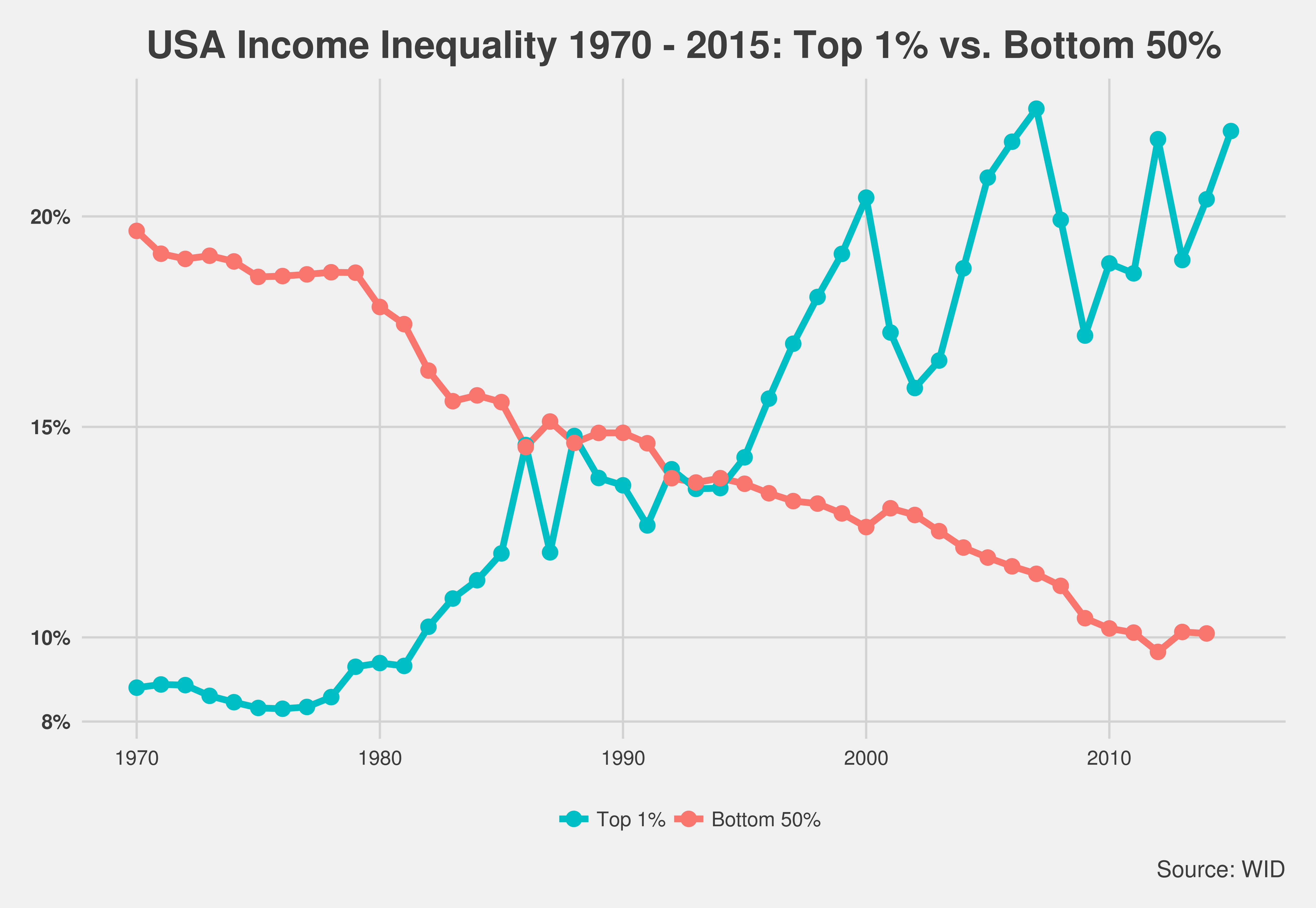
Anyways, I decided to graph US income inequality for the period selected. The graph is below. While the trends are clear, the 1% rising and the bottom 50%

declining over time, note the changes starting in 2012 where the bottom 50% start to make some small gains while hovering around a 10% share of all US income. On the other hand, the top 1% are now almost back to the level it had before the 2008 global crisis.
For the sake of comparison, I decided to graph the same indicators for France. The graph is presented below.
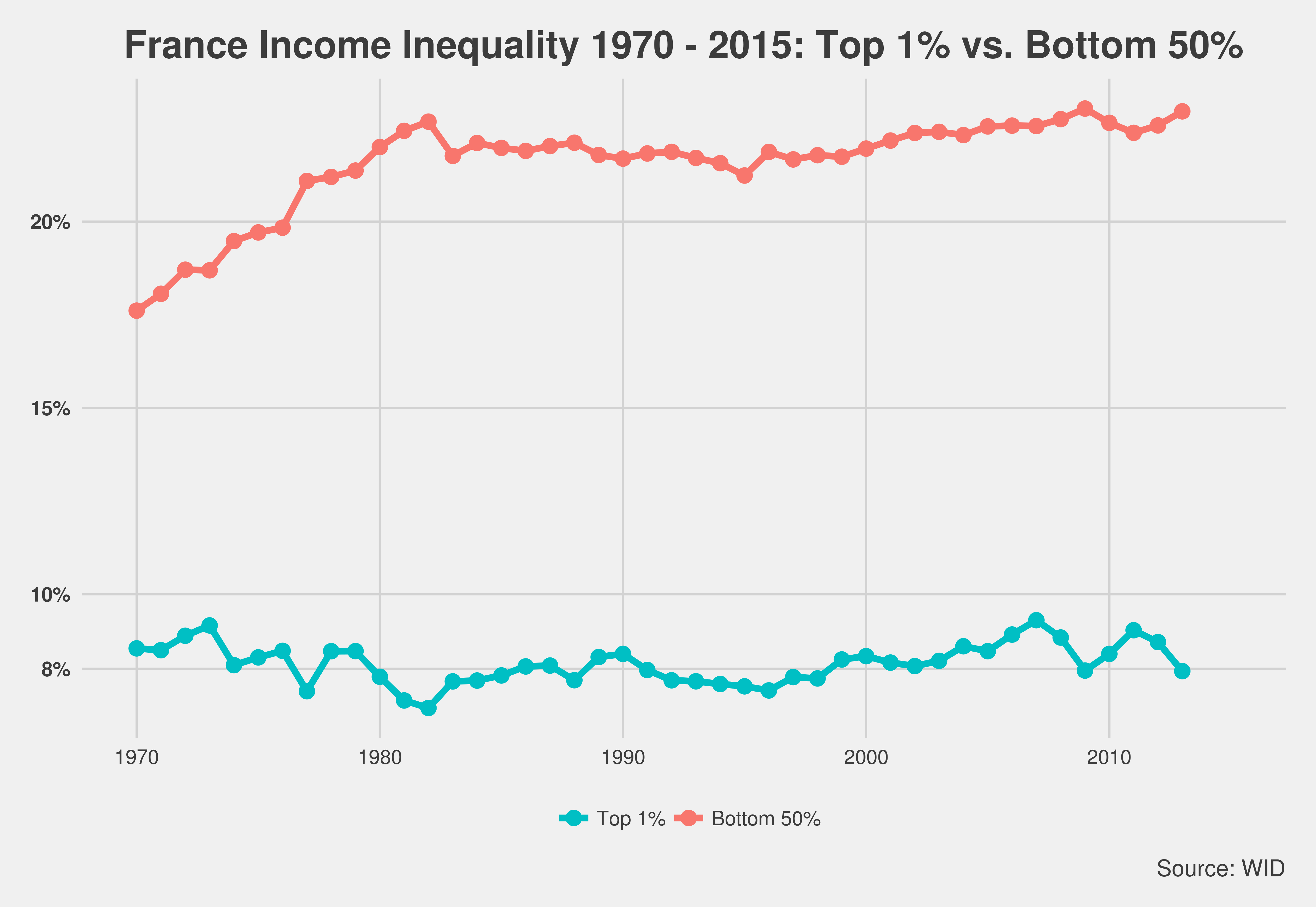
Little variation seems to exist in France when we look at the income trends for our two groups. The top 1% has not had a10% share of total national income in the period under consideration. And the bottom 50% have indeed been slowing gaining, ignoring the 2008 dip due to the crisis, since 1985. This in stark contrast with the US income inequality status.
Maybe this is one of the reasons why France is the land of “liberté, égalité et fraternité“.
Cheers, Raúl

Comments
3 Responses to “Wealth and Income Inequality Data”