Like many others, I have been drawn to maps since I was a kid, although I cannot explain why in one sentence. Context does provide key insights, though. I grew up in what I call the voluminous analog encyclopedia era, when many could find the multiple beautifully bound volumes sitting patiently in their homes, thanks to well-meaning parents who wanted the best education for their children. Undoubtedly, such a collection was also a status symbol, as few could afford it. I recall encyclopedia vendors knocking on doors, some offering my father monthly payment plans at not-so-low interest rates. Still, only middle-class families could afford them in a country where such a class was tiny, in contrast with the so-called developed world—known as the First World back then.
Born in the Global South, just over 1,700 kilometers (~1,100 miles) from the Global Hegemon, I found that the short geographical distance did not automatically translate into fast, agile communication. Instead, international media and cultural information took ages to arrive, from science and books to films and live rock concerts. Do not blame tariffs, though. Back then, the country already had a pretty bad reputation thanks to persistent and almost chronic violence and pervasive insecurity that essentially erected invisible entry barriers to potential immigrants, dollar-carrying tourists and information dissemination tout court. I felt like we were living in almost complete isolation, which made me a bit angry. Even more so, because I could not understand why. So close and yet so far away.
In such a milieu, maps became colorful paper windows that offered an imaginary, fascinating glimpse of a very remote world I thought I would never set foot on. The idea of traveling from home to, say, Egypt seemed more utopian than going to the moon. Yet maps offered an alternative travel route that, combined with the encyclopedia, could feed my hungry imagination and create fascinating imaginaries. The notable absence of photos and other pictorials of remote locations added more fuel to my imaginary world. I was free to recreate self-designed versions of the world. My father had also secured a copy of the fantastic Larousse Dictionary, which, unlike the traditional ones, included brief descriptions of key historical figures and locations. It was a thick volume with a pinkish hard cover and tiny print that seemed to contain almost infinite information. I could spend hours browsing it.
I was 10 years old when I learned that Abebe Bikila, the amazing Ethiopian marathon runner, had won the Olympic race in Rome, running barefoot. He also won in Tokyo 64, but this time he wore shoes. I had no idea where Ethiopia was, but Bikila was, for me, a real hero regardless. Maps and Larousse helped me get to Ethiopia quickly, while the encyclopedia provided more nuanced details. I thought its capital, Addis Ababa, had such a cool name. Little did I know then that 30 years later I would be in Addis for the first time ever.
I always wanted a medium-sized rotating metallic globe I could place in my bedroom to explore the world whenever I wanted. Getting one back then was not only almost impossible but also utterly expensive. So Santa Claus never delivered, and birthdays could never justify throwing tons of money at the 3-D map. I must admit that Superman, the comic book version, played a role here. His alter ego, Mr. Kent, worked as a journalist at the Daily Planet. This imaginary news outlet owned a whole building with a gigantic 3-D globe on top, complete with an equatorial ring that imitated Saturn. That was much cooler than the flying and X-ray-visioned Superman, an undocumented immigrant with a severe bipolar disorder dedicated to saving the world from unspeakable evil. We should be thankful ICE was not operational at the time.
I was, of course, very late to the party that knew that Superman’s Daily Planet was based on the 1930 Art Deco Daily News building on East 42nd Street in New York City, a stone’s throw from the UN headquarters. It also has a globe located in the main lobby, not at the top of the building. The globe, which is constantly rotating, is almost 4 meters (12 feet) in diameter and weighs 1.8 tons. The first time I visited the city in the late 1970s, I went to see it with my own eyes. It was smaller than my imaginary version but still very impressive. I had no idea that twenty years later, I would spend years in and out of the building on business.
Unable to secure a globe, I had to settle for flatland maps. In school, all maps used the Mercator projection with a couple of peculiar and interrelated features. First, the Equator was not in the middle of the map, a fact I could not quite understand. Instead, the Equator had shifted down by several centimeters. Moreover, Antarctica was nowhere to be found. It had vanished into thin air as if it did not exist. It seemed whoever printed these maps was looking at the globe from a Northern perspective, which obviously made countries in that section much more visible. Since we were in the Global South, why not print a map from the opposite perspective so our countries would show up more prominently? The question was never addressed. Most people thought it was not that important anyway. But the issue was not that simple.
The answer came in 1976. I was already enrolled at the university and had to take a human geography course. The professor, Ernesto Guhl, was a German immigrant who had decided to cross the invisible entry barriers forty years before attempting to escape Hitler. He was also one of the best professors I had ever had and knew the local geography inside and out. He is now considered the father of the country’s human geography. He was also a very nice person, had a great sense of humor, and loved taking the class on field trips to experience the country’s amazing geography. Although I never asked him, I am sure he had heard about the country from Humboldt, who visited in 1801 and spent almost a year traveling around.
Professor Gulh explained to us how the Mercator projection worked. We have to give it to Mr. Mercator (or Mr. Kremer!), who in the late 16th century found a mathematical formula to project a sphere-like planet Earth onto a cylinder. However, the solution meant that surfaces closer to the poles (North and South) would increase in size as they approached the extremes. But Mercator’s map was designed for navigation, so exact continental or country size mattered less as long as navigation coordinates were precise. And they were, and still are, today.
I was shattered. The school maps I grew up with created a map imaginary that distorted the size of countries and continents. While I questioned it from a cardinal perspective, I never challenged the now-obvious fact that, for example, Greenland was almost as big as all of Africa, or that Europe was much bigger than Algeria. And so on and so forth. Antarctica’s absence from Northern-centered Mercator school maps could be explained by the fact that it is a huge continent and would take up almost half the map if projected à la Mercator and viewed from a Southern-centered perspective. Antarctica is almost seven times as big as Greenland! In any event, all this could have been avoided if Santa had agreed to bring me my metallic and rotating globe!
Professor Gulh had a magic card up his sleeve to deliver the final imaginary knockout. He had a hard copy of the 1973 Peters projection in German, alongside an 11-page booklet in Spanish. He gave us all a copy of the map and booklet to keep. The photo below shows my copy of the Peters projection, which I still have.
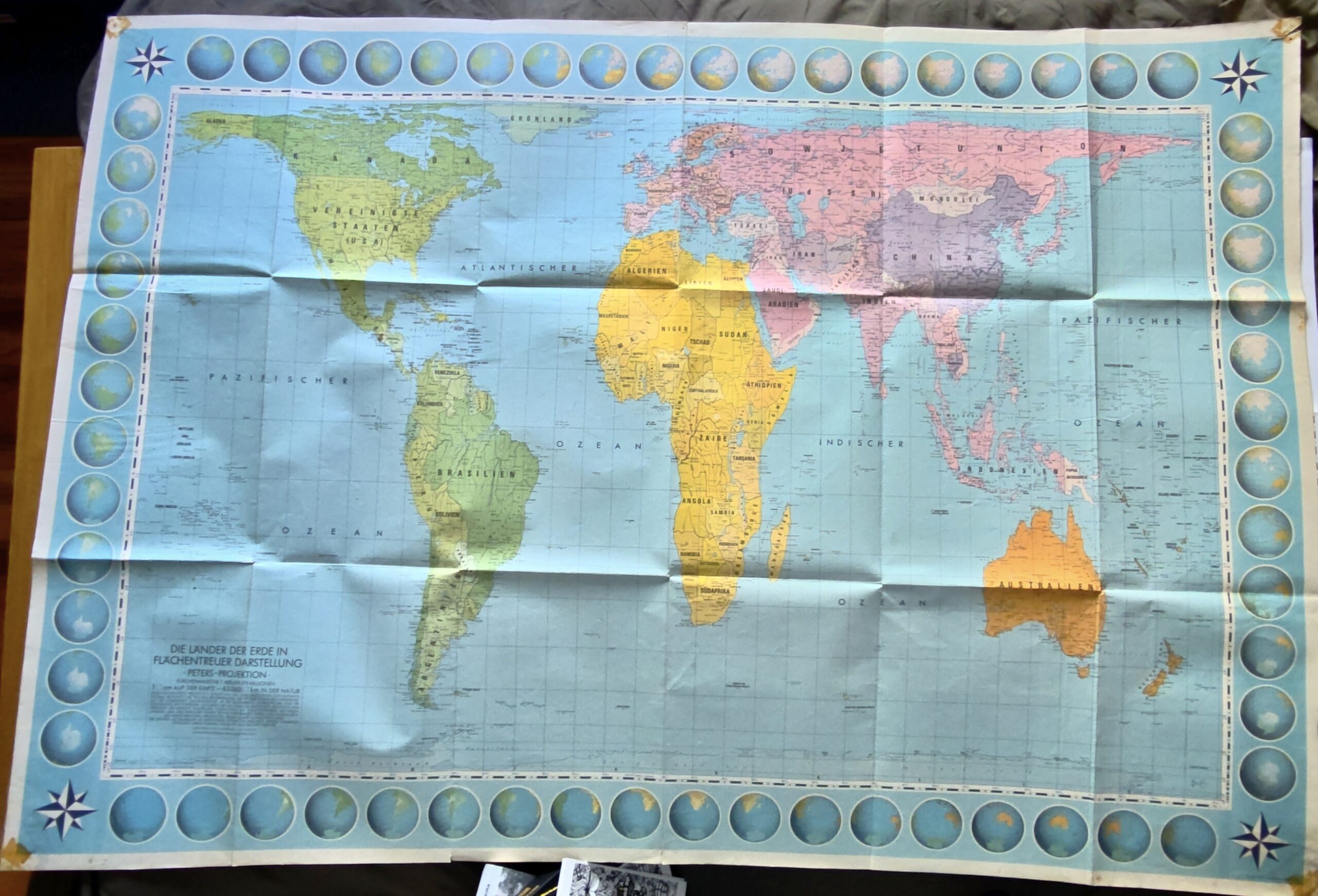
Gall first developed this projection in the late 19th century, a fact Peters apparently forgot to mention. Indeed, the companion booklet I have does not mention this at all.
Twenty-five years later, my son was already in elementary school just North of New York City. One day he started asking us about maps. I told him part of the story above, briefly. And I showed him my German version of the map. Given his interest, I bought a Gall-Peters projection map in English and hung it above his bed. No need to recreate lousy map imaginaries. Several weeks later, we had friends over and, out of the blue, he asked them, “What is the capital of Namibia?” None of the guests knew. That was followed by questions about the capital cities in Africa and Asia that most did not know. Then the guests turned the tables and asked him about other countries. He seemed to know most of them. Apparently, he had spent some time traveling around the world via the colorful paper window and memorizing capital cities in the process. I certainly did not expect that.
A few days ago, the United Nations General Assembly voted to adopt the Equal Earth projection map as the standard, replacing Mercator’s. 164 countries voted in favor, while one, the U.S., opposed it on ideological grounds. Go figure. In any case, such action comes 50 years too late for me.
Raul